Design Over Time
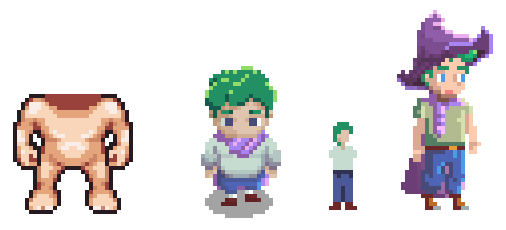
Change happens, and that can be great even when it feels like a step back. While I've been making some good progress on the dev side of things, I wanted to talk about the art side for my first post. These were my first concepts. The left most being the base body available from the free Universal LPC Sprite Maker. This was good to get started with some tutorials but ultimately I knew I wanted to design my own.
Then came the next, which tried to keep in a 16x32 grid but he had some padding. I began to design other assets with this character without really giving it much thought beyond, "I like the look of this guy, on to the next thing!" That's going to be a common pain, I believe, but one that ultimately results in me exploring and trying more things even if it's the path of most resistance.
After I designed some tables and planters I revisited some of the videos below, namely Brandon's on considerations for sprite size. I toyed around with the idea for a couple hours of going even smaller in detail (sprite 3 below) but gave up on him quickly. Perhaps I'll revisit him for a game within the game, but this size would limit my ability to add 'cute' into the concepts so I was back to the drawing board.
Then the last sprite, image 4, was born. Following tutorials from Younis, I started to find a style that was fun and would allow for way more detail to outfits in normal gameplay. I was convinced this would be the sprite size for me and went about building out a ton of assets to fit this 1x3 character ratio.
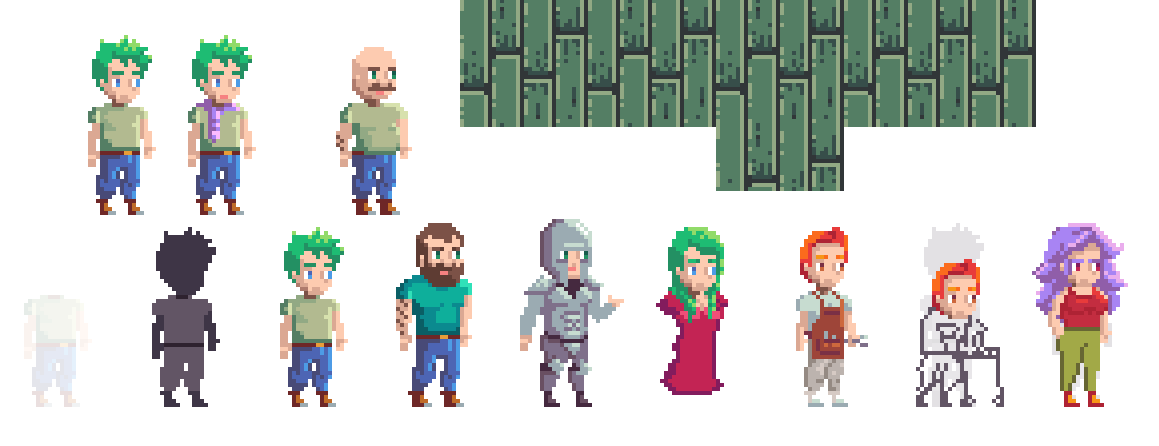
I even spent a night just playing around with the character dimensions and doodling some other character concepts using this ratio. None of this is 'lost' time as the practice is needed and I love what I came up for the mechanic's apron so I'll try and reuse that later on. This is about the time I started to fret about color pallets but more on that another day.
I then spent a couple nights thinking through what repeating assets I would need for flooring and walls and this is where I spent too much time trying to think through a color pallet before deciding "I can always change colors later, don't use this as an excuse to slow down!" So I moved forward with some of the concepts you see below for a while. The game didn't look great at that time, lol.
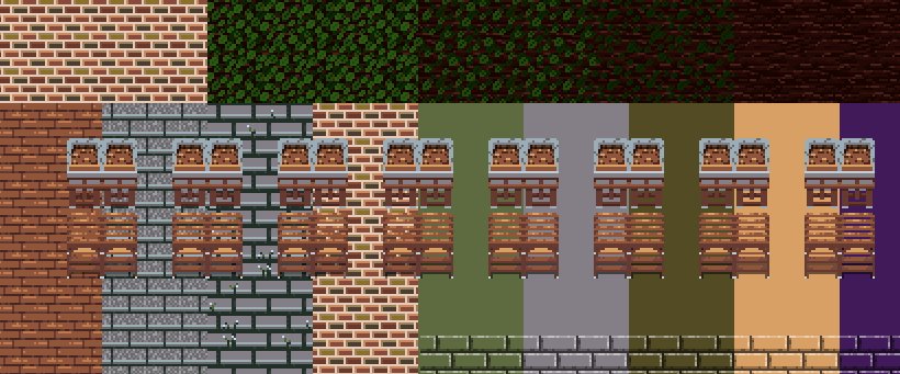
You can view the progress of that work below.
But I'm happy to say that most of that was just accidental practice as I've updated the character sprite to much closer to 1x2 for sprite size. What I like about this new sprite is that it keeps the game in the same cute style I was wanting but will make character customization real more approachable. I battled with the idea of higher fidelity characters but fewer cosmetics and decided that the ability to personalize your character is too important for me longer term. Will that be available anywhere near the start? No! But I know I want to implement it at some point.
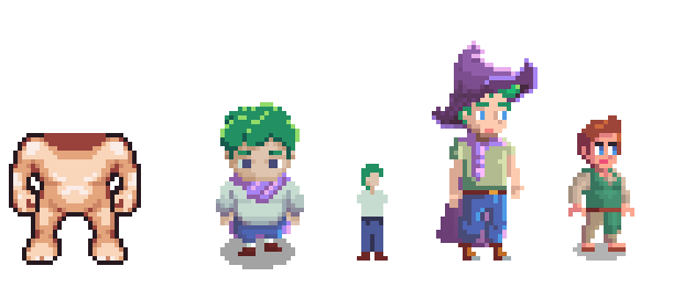
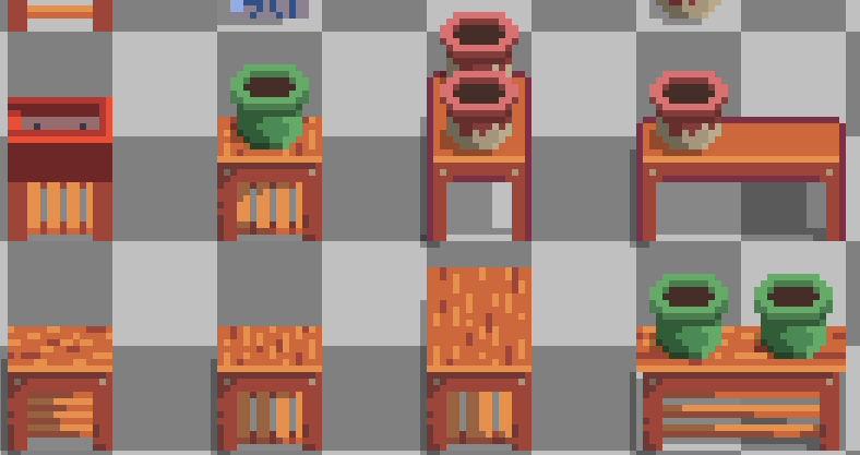
Once I had the new character sprite size figured out, it was time to make some assets so I could load them into the game. With the game elements, I'm focusing primarily on the shop for now. That meant I needed tables and pots essentially, so I played around with that for a night or two. I landed on the shape below which cuts the horizontal space a bit but I think that brings the camera 'down' a bit so that the most-side facing character doesn't look out of place without needing to be a platformer T.T
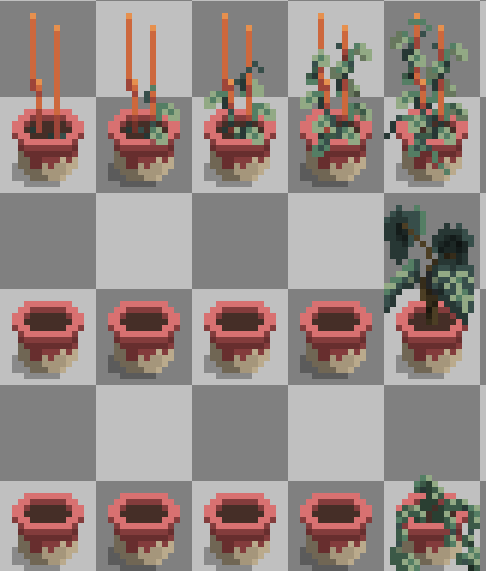
After a few hours of table work I needed a break and so I began sketching out some of the starting plants that are supposed to be actual plants (before the more fantasy options come in). I started with their 'final form' if you will and then designed backwards from there. I only got the Pothos done for testing (eventually) but will keep (most) plants in this 1x2 grid as well.
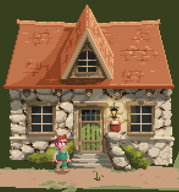
I still have miles ahead of me but now that the art style (or at least size) is beginning to finalize I can pour more time into assets I'm more confident will get used. My next update will be more dev focused on where I am, but I hope you enjoy the (probably) final scale for The Last Druid.
Until then,
The Fabled Druid ^.^
Links
Below are some of the videos I watched at least twice while trying to decide what size and style my characters and world should be. They didn't give me the 'answer' but instead the tools to help me decide what was right for me, both in vibe I was going for as well as time/budget I would have to produce the assets I needed.
Brandon James Greer - What Size is Pixel Art?
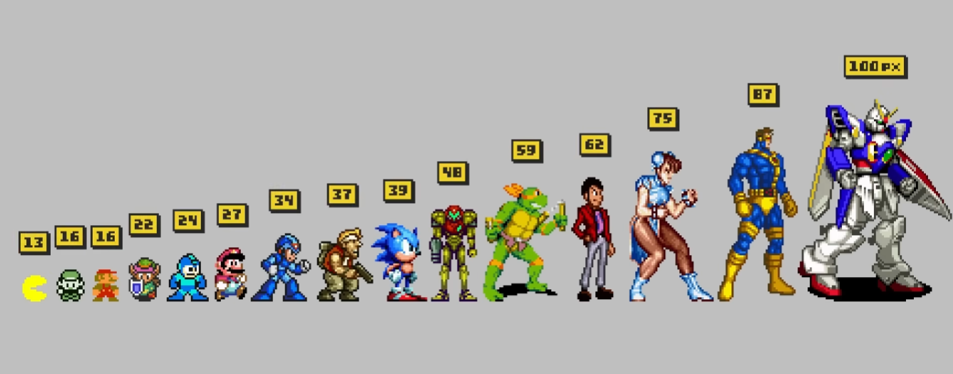
Pixel Overlord -What Canvas Size Should You Use for Pixel Art?
Adam C Younis - Pixel Art Class (I find myself revisiting his videos a lot!)
[WIP] The Last Druid
A cozy RPG where you revive a plant shop with help from townsfolk and magical creatures you rescue and befriend!
| Status | In development |
| Author | TheFabledDruid |
| Genre | Simulation, Adventure, Role Playing |
| Tags | 2D, Cute, Fantasy, Pixel Art, Singleplayer |
More posts
- Devlog 2024.11.15Nov 15, 2024
Leave a comment
Log in with itch.io to leave a comment.